In Production
These are AI systems I’ve put in front of real users, under real constraints — with the failure modes that only show up in production.
A deliberately mixed set — an agentic pipeline, a piece of targeted machine learning, a curatorial system, a set of courses — held together not by a technique but by a question: when a model sits inside something people depend on, what is it trusted with, and what is it never? Drawing that line well is most of the work.
Grant CopilotCensus evidence for grant writers — cited answers, no hallucinated numbers.
SiteLineA public tax-credit scoring app, with an ML prediction layer for Invest Atlanta.
Carlos MuseumEncoding curators’ judgment to make museum text accessible, at scale.
AI in the classroomCourses that require AI where it helps and exclude it where the learning is.
Grant Copilot
Nonprofit grant writers live or die on evidence. A strong proposal needs current, specific, local numbers — poverty rates, housing burden, population change — for exactly the neighborhood a program serves. That evidence exists, in the U.S. Census, and it is effectively locked away from the people who need it most. Census data spans nine nested geography levels, tens of thousands of variables hidden behind opaque codes, and product lines that don’t line up cleanly year to year. A grant writer at a food pantry is an expert in their community, not in FIPS codes and table shells — so the most defensible evidence goes unused, and proposals fall back on stale round numbers or none at all.
Grant Copilot closes that gap. You ask a question the way you’d actually say it — “I’m writing a food pantry grant for Southwest Atlanta” — and it returns a paragraph of quantitative prose: the relevant numbers, how they compare to the county and the nation, how they’ve moved over time, and a citation for every figure down to the Census variable, year, and geography.

The architecture is a deliberate split between what a model is allowed to do and what it is not. A user’s question first goes to an LLM — Gemini 2.5 Flash on Vertex AI, run under a zero-data-retention configuration so no user text is retained — whose only job is interpretation: turn the plain-English request into a structured intent of what is being asked, about which place, along which dimensions. It resolves nothing on its own.
Geography resolution is deterministic. “Southwest Atlanta” is matched against a geographic gazetteer built into a SpatiaLite database — the spatial extension to SQLite — that maps place language to the exact Census geographies and FIPS codes it overlaps. The model proposes; the gazetteer decides, and a place it can’t resolve is reported as unresolved rather than guessed. Numeric retrieval is deterministic too: once geographies and variables are fixed, the figures come straight from the Census API — exact values for exact codes, no model in the loop. Even peer selection — which nearby or similar places to compare against — runs on a FAISS vector index over place embeddings, so “similar” is a computed nearest-neighbor result, not an opinion.
Only at the end does a model reappear, taking the retrieved, already-correct numbers and writing them up as prose with every figure carrying its citation. Its job is language, not fact: it can phrase a number, it cannot change one. The tool is bring-your-own-credentials — each user runs it against their own Google Cloud project, Census key, and compute — which keeps cost and data under the user’s control rather than pooled in a shared service.
Under the hood, that split is a twelve-stage pipeline, and the engineering is in how little of it a model touches. A query passes through scope-gating, intent extraction, geography resolution, grant-frame matching, routing, planning, plan review, Census fetches, aggregation, enrichment, and synthesis — twelve stages, of which only a handful ever call a model. Everything else is deterministic Python running against a pre-built data layer: a 177-entry curated concept map that pins the right ACS table and variable pair for a common need, a 55-entry grant-narrative frame registry, the SpatiaLite gazetteer, a peer-features database, and a 2.4-million-vector FAISS index that is consulted only when the curated map misses. Biasing hard toward the deterministic path is the point — it holds a typical query to two-to-four model calls where a naive LLM-first design would spend fifteen or twenty, and it turns the failure modes that quietly sink Census chatbots (near-miss hallucination, mistaking a subgroup for the universe, confusing race-stratified tables, answering out-of-scope questions anyway) into cases each met by a deterministic guard rather than a hope. Every answer also lands as an audit trail — the prose, a plain-English list of every variable used, and one CSV per geography level — so a reviewer can open the folder and trace which ACS cells produced which sentence.
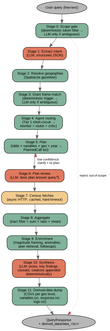
The human/AI line. This is the entry that shows the line most cleanly, because the architecture is the line. The model is trusted with the two things models are genuinely good at under uncertainty — understanding a messy request, and turning structured facts into readable prose — and with nothing else. It does not decide which geography you meant; the gazetteer does. It does not produce a single number; the Census API does. It does not judge which places are comparable; the index does. Every figure in the output is traceable to a source because no figure ever passed through a model. That is the choice that makes the tool usable for something as consequential as funding: a grant writer can defend every number to a skeptical program officer, because the system is built so that hallucination has nowhere to enter the numeric path.
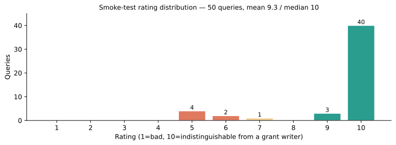
Outcome. Grant Copilot runs today as an open, documented tool. In a 50-query gold-standard smoke test — spanning ordinary needs statements through deliberately adversarial edge cases like out-of-scope questions and compound geographies — 40 of the 50 answers were rated 10/10, the rubric’s mark for indistinguishable from a grant writer’s own, with a mean of 9.3 and a median of 10. The handful that scored lower were mostly empty-plan cases that returned an honest “data unavailable” rather than a confident wrong number — the failure mode the whole design is built to prefer. What’s next is breadth — more Census product lines, a wider gazetteer — and packaging the credential setup so a non-technical grant writer can stand it up without a developer.
SiteLine
An Invest Atlanta × Emory collaboration
Georgia hands out the federal Low-Income Housing Tax Credits that get most affordable housing built through a Qualified Allocation Plan — a long, dense rulebook that scores every application on dozens of criteria, from distance-to-grocery to neighborhood stability to what else got funded nearby. The score is knowable, but only if you can read the rulebook, assemble a dozen public datasets, and compute it parcel by parcel. Large developers hire consultants to do exactly that. The small developers — the ones affordable housing most needs — usually can’t, so they go in blind on the one number that most determines whether a project pencils out. SiteLine exists to level that field.
The public app scores any parcel in the 11-county Atlanta metro in seconds, computing the QAP’s location criteria from a dozen public datasets — a faithful reproduction of the rulebook, not a guess at it. Then it goes wider: it colors the entire scoring landscape across a 54,000-point grid, so you see not one parcel’s score but the whole terrain. The most valuable parcels sit on cliffs — a tract line here, a school attendance zone there — where a few feet swing the score, and the map makes every cliff visible.
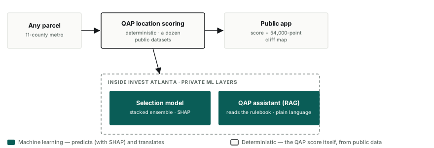
The architecture. The version running inside Invest Atlanta adds two private layers, and this is where the machine learning lives. A prediction model — a stacked ensemble trained on 1,000+ Georgia applications from 2016–2024 — estimates the probability that an application is actually selected, with SHAP explanations attached, so a developer sees why a site scores the way it does, not just whether. And a retrieval-augmented assistant reads the actual QAP documents from 2020 to the present and answers application questions in plain language — tuned specifically to strip the legalese, because a rulebook you can’t parse is a wall, not a rule.
The most useful thing the modeling turned up is a statistical result, not a feature: the QAP’s many scores are not many signals. Seven criteria predict selection nearly as well as all twenty-three, because a site that’s strong on a few tends to be strong on the rest — site quality is closer to one number than the rulebook’s columns suggest. Knowing that changes how you search: you stop trying to win every criterion and start finding the few that carry the others.
The human/AI line. Not every AI system is an agent, and SiteLine is the case in point — the intelligence here is targeted data science, and the line runs between computation and prediction. The QAP score itself is deterministic: a faithful computation of the published rulebook from public data, auditable line by line, because a score a developer will stake a project on cannot be a model’s opinion. The model’s job is the genuinely predictive part — estimating selection probability from history — and every prediction ships with its SHAP reasons, because a number with no why isn’t decision support, it’s a magic 8-ball. The RAG assistant translates the rulebook; it doesn’t rule on anything. And the whole thing rests on a discipline that’s easy to skip: the data’s weaknesses are documented as carefully as its sources — coverage gaps, vintage mismatches, the tracts where a public dataset runs thin — because guidance you can’t audit isn’t guidance. The tool sharpens a developer’s judgment; it never substitutes for it, and it never hides how confident it should be.
Outcome. SiteLine’s public scoring app is live for the whole 11-county metro, and the full version — the selection model and the QAP assistant — runs inside Invest Atlanta. It was built with student developers through Emory’s experiential AI programs, AI-assisted throughout, and that’s part of the point: a small team shipped a real decision-support tool for a public agency, on public data, with its uncertainty documented rather than hidden. What’s next is depth — more of the QAP’s criteria in the public score, more years of applications behind the model — while keeping the deterministic score and the predictive layer cleanly separated as both grow.
Carlos Museum — codifying curatorial judgment
Every object in a museum comes with a written description — the wall text and catalog prose that tell a visitor what they’re looking at — and writing it well is hard in a specific way. Curatorial expertise cuts two ways at once. Individually, curators catch the small things: a term that’s no longer accurate, a word that’s fallen out of acceptable use, the kind of error a dictionary search will find. What’s far harder to catch is the forest: descriptions so dense with specialist vocabulary that an educated college student can finish one with no idea what the object actually is. The standard for a good description is real, and every curator knows it on sight — but it resists being written down. It’s know-it-when-you-see-it judgment, which is exactly the kind of thing that’s hard to apply consistently across thousands of objects.

The process encodes that judgment deliberately, in stages, and the order is the whole point. First, ingest the museum’s existing description corpus. Then a modern LLM, running zero-shot with a curator in the loop, reads across the corpus and surfaces the recurring patterns that separate an accessible description from an inaccessible one — compressing years of experiential judgment into something explicit. Those patterns are parsed into concrete writing rules. Then the crucial step: curators review the rules and accept them, or don’t. Only after human acceptance is the process applied algorithmically across the full corpus. The model never runs ahead of the people whose standard it’s encoding. (An earlier version took a different route — phrase-level bias detection with RoBERTa and LLM rewriting; the zero-shot-plus-rules pipeline is the mature form.)
The human/AI line. This is the purest version of the line on the page. The model never decides what good curatorial writing is. It compresses a standard that humans articulated, and it scales a standard that humans validated and accepted — and nothing is applied until they do. AI sees the forest; humans own the definition of a healthy tree. It’s the site’s whole thesis in production: human expertise encoded on purpose, then scaled past what any curatorial team could do by hand.
The enriched descriptions have a second life, too: they now power curated museum tours with AI audio companions that adapt to what each visitor wants to explore — still wholly grounded in the curators’ expertise, using AI only for the scaling a human team can’t do.
Outcome. The system is in production at the Michael C. Carlos Museum. There’s no code to link — it’s now the museum’s proprietary system — so this writeup and its diagram stand on their own, which is the honest way to describe a system I can’t open-source.
AI in the classroom — required, not banned
AI is a fact of the world now, in every discipline. Banning it for a semester doesn’t make it go away; it pushes students into unguided, undisclosed use — which produces exactly the low-quality slop the ban was meant to prevent. The alternative isn’t looser rules, it’s better course design: require AI where it genuinely advances a learning goal, exclude it where the learning is the point, and treat its failures as material worth studying.
That principle came out of a teaching taskforce I worked on — guides and worked examples for educators on using AI in service of learning goals rather than against them, showing where it works and where it breaks. Those documents are institutional and stay internal; what follows is the framework, not the files. The three course designs below are my own, and I can talk about them freely.
DATASCI 110. In my intro course, the two assessment types pull in opposite directions on purpose. In-class exams are AI-free and test concepts — all the thinking is the student’s. Every problem set, by contrast, requires AI and is graded for completion, which takes the policing out of it: a student who offloads everything to the model will simply fail the exam that follows. The anchor is a difference-in-differences / regression-discontinuity assignment. Handed to an AI with naive framing, the model confidently suggests controlling for confounding with a regression — and in class, students learn why that’s impossible (if you could just enumerate the confounders, the whole problem would already be solved). The interesting part is why the model says it: fifty years of the field’s pre-causal-reckoning habits are in its training data, so it faithfully reproduces the discipline’s average mistake. Training data is a prior; here the failure mode is the curriculum. It’s “priors all the way down,” lived. (This is the same course, from the teaching side.)
HIST 100 (Perspectives on the Past). Here AI is required from day one — to ingest articles and passages and visualize the connections across them, because humans read single texts well and corpus-scale patterns badly. But a good visualization requires understanding, and the electrified rocks don’t have any: students prompt, direct, and refine the output, then turn and study what the machine’s average argument (it’s just KNN!) throws away — the nuance, the punch, the lived experience that make history worth doing. AI giveth and AI taketh away.
DATASCI 160 (Intro to Coding). Claude Code from day one; memorizing syntax is over. Students write the plan, not the loop — and learn to notice when the assistant writes a triple for-loop in R and to say why it’s wrong. The curriculum moves to what now matters: modular design when a model can dump a whole repo on you, debugging as system design, coding choices as decisions with consequences. And the empirical backdrop, from published research on AI-assisted productivity, is that the gains compound with expertise — past a threshold, subject-matter judgment beats raw coding speed.
The line, and the close. The throughline is the same in all three: AI is required where it accelerates, excluded where the learning is the point, and interrogated where it fails. The line isn’t a rule laid on top of the courses — it’s the principle they’re designed from. AI is here to help, not replace; everything still needs an expert to make it tick. Not a threat — a way to make human work more human, faster.